BRANDS2LIFE
BRAND OVERHAUL //

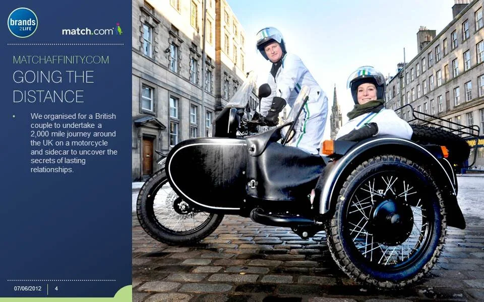
BRIEF //
Review all Brands2Life’s visual communication help them standout from their competitors, distance themselves from their history as a technology leader by becoming more consumer friendly, improve delivery of presentations as well as making everything practical, clean and functional.
SOLUTION //
I focussed on the two colours present in their current logo (which they weren’t willing to change) and extended it across all of their communication points. The blue maintained the tech and corporate side of the business where the green its complimentary colours could be introduced to not only differentiate different areas of their practice but also lighten the whole brand. Implementing clear document structures also helped staff manage and communicate clearer as press cuttings and coverage comes in all shapes and sizes. The overhaul brought Brands2Life up-to-speed with it’s competitors and didn’t disillusion potential consumer clients.
ROLE //
Art Direction
Design
Marketing