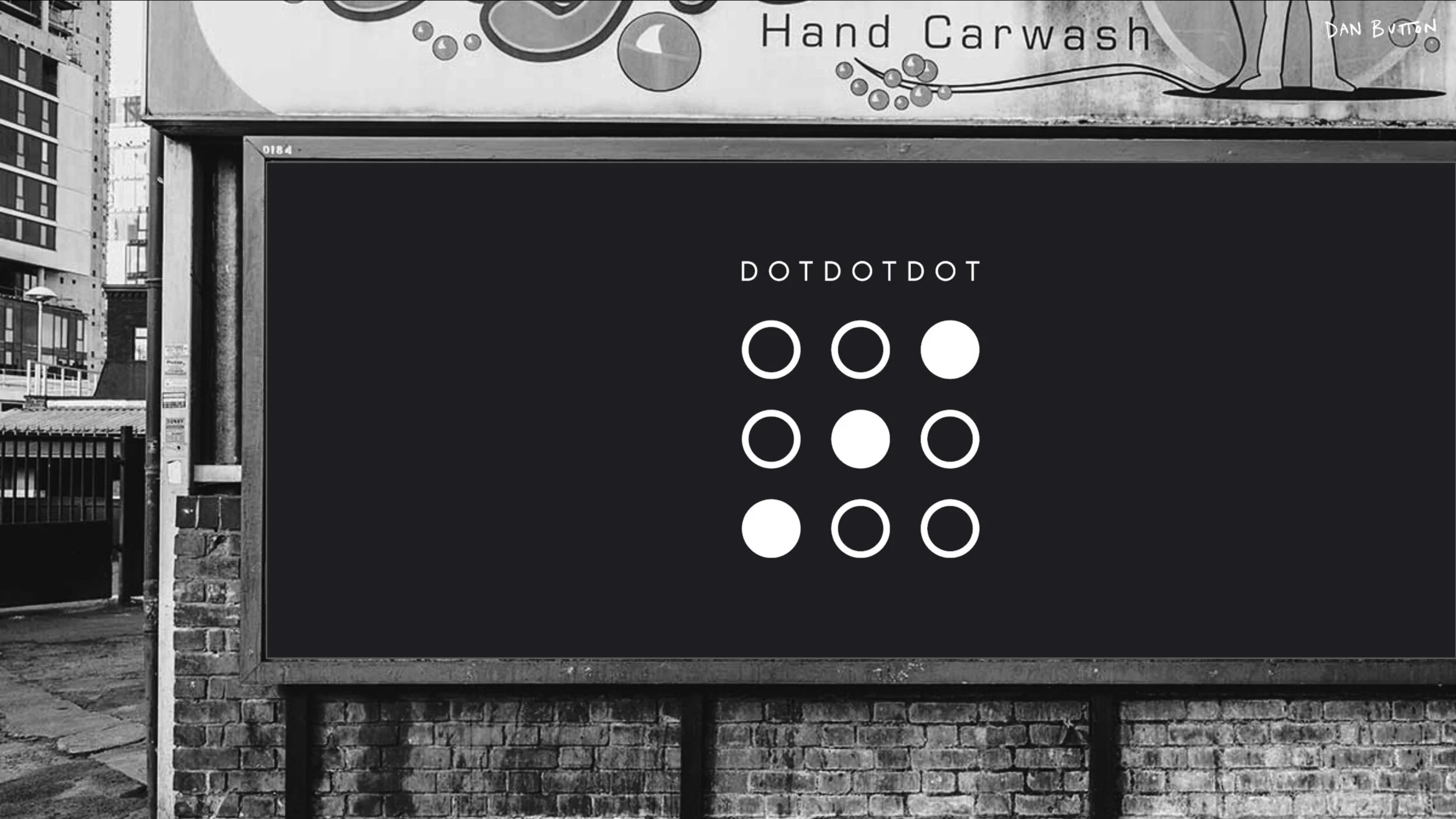
DOT DOT DOT
BRAND REFRESH / 2020 //

BRIEF //
DOT DOT DOT is a community of Founders, CEOs and leaders from the creative, media, entertainment and culture industries. They come together to explore and better understand the challenges facing people and the planet, and we add weight, wisdom, resource and reach to social and environmental innovators who have set out with solutions. They needed to be seen as serious, have a visual impact, but to be slightly ‘shadowy’ and obscured so as to portray an element of intrigue and knowing. The brand needed to cool – to attract that the type of members that would evoke creative change – and to not be stuffy, dry or corporate. Dot Dot Dot is ultimately about people and making things better and the brand needs to reflect all of that.
SOLUTION //
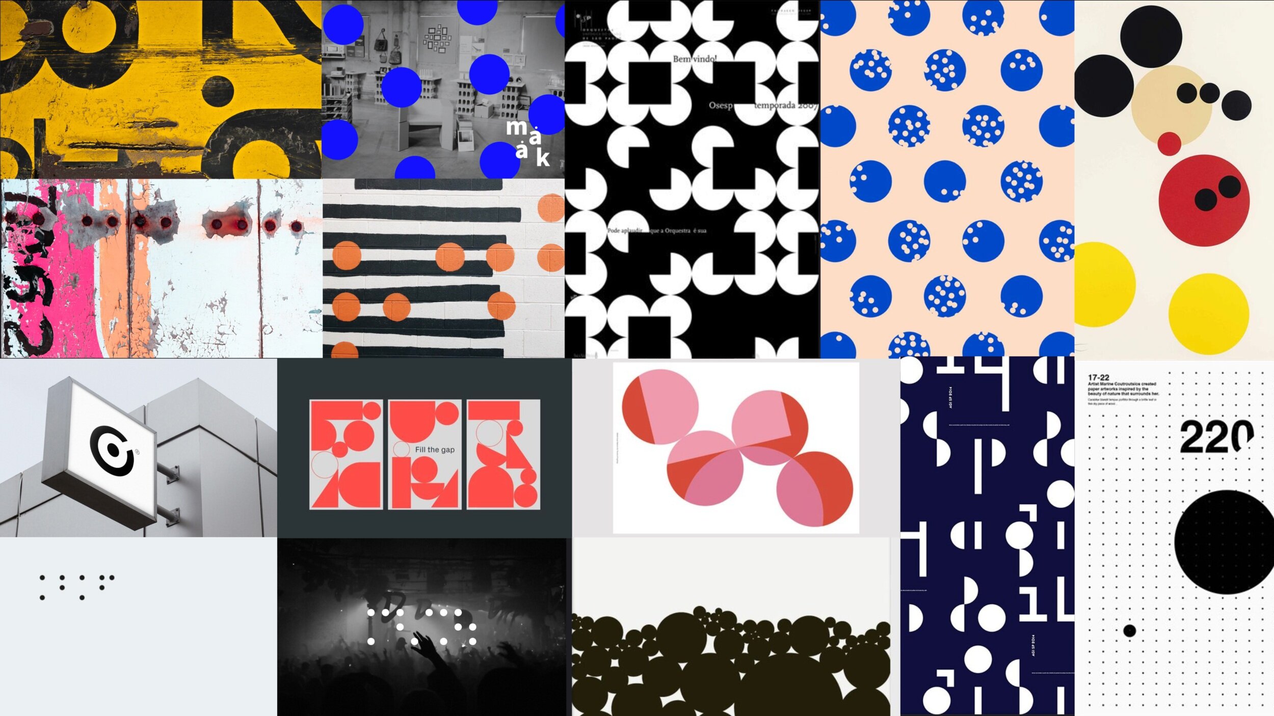
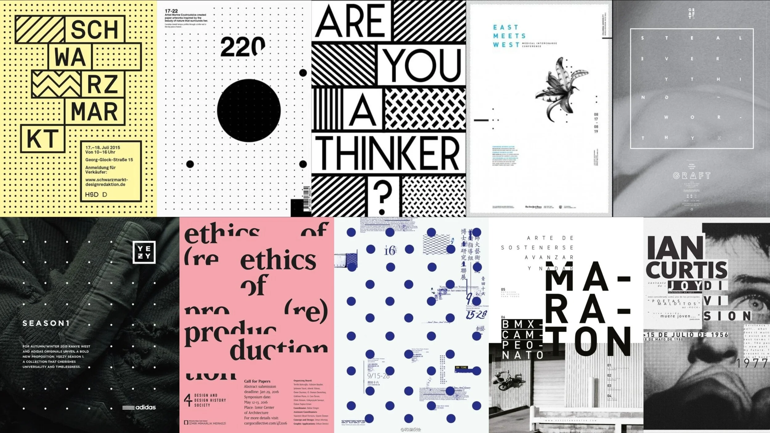
The brand’s identity factors community, creativity, flexibility, and potential by incorporating the literal • • • into a powerful network. The dots representing anticipation, optimism and opportunity. Within that network the three dots manoeuvre and communicate in many ways. The rich dark colours – mysterious and ambiguous – punctuated with contemporary and confident highlights that show a maturity alongside a creative playfulness bursting to show what it can do.
ROLE //
DesignStrategy
Design Direction
Design